So you know how machine learning models depend on data? Like…TONS of it?
Well, here’s an ugly truth about data.
Data can be dramatic.

ML Engineer: “Hi Data, which features matter most to you?”
Data:
It shows up late, brings too many columns, and insists that everything is important. You open a dataset, and it’s as if every feature is shouting, “Pick me! I matter!”
Meanwhile, your poor algorithm just wants some peace so it can actually learn something.
Well, lucky for you (and your data), there’s an almost magic-like tool that basically helps your data get its sh*t together: Principal Component Analysis (PCA).

📈 What Is PCA?
I’m sure you’ve heard the term “less is more”.
Well, PCA is like the master of that concept.
Principal Component Analysis (PCA) is a technique that simplifies complex data by keeping only the most important information — it turns “too much data” into “just enough” to understand what really matters.
Our data can sometimes be like a tangled ball of yarn: too many columns/features, messy correlations, and a growing sense of existential dread.
PCA comes in like a therapist with a clipboard and politely untangles all that. It does the following:
Your dataset has tons of features — some useful, some redundant, and some just noisy.
PCA finds the directions (called principal components) where your data varies the most.
It then re-expresses your data in terms of these directions, cutting out the fluff, while keeping the essence.
Ever meet someone who knows how to get you to calm down and focus on what matters when you’re feeling overwhelmed?
Their name might as well be PCA.

🔍 Example of PCA
Imagine we have a dataset of students with 2 features:
Hours spent studying a week. 📚
Hours spent sleeping per night. 😴
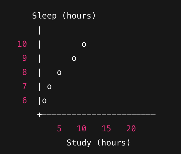
When plotted on a 2D graph, it may look something like this:

You’ll notice the points form a slanted cloud — students who study more tend to sleep less.
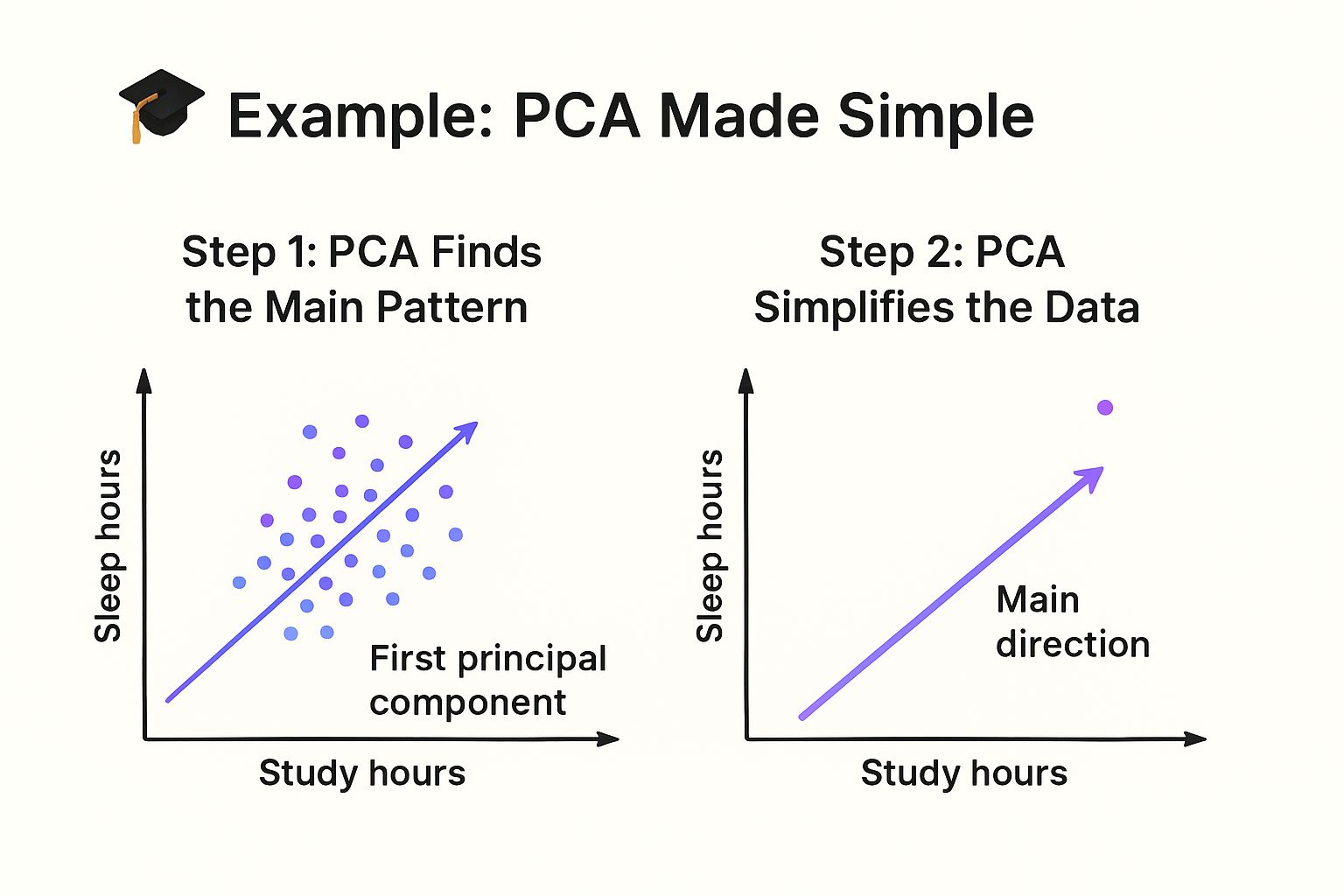
Step 1:
PCA draws an imaginary line (called the first principal component) that goes right through the middle of that cloud — the direction where the data spreads out the most.
That line basically says: “Most of what’s happening in this data can be explained by this one direction — study more, sleep less.”
Step 2:
Instead of keeping both features (study hours and sleep hours), PCA lets you keep just that one main direction — the “study-sleep tradeoff” — while still capturing most of the information.
It’s like saying: “Forget tracking both study and sleep. Just track this one thing that summarizes them both.”
Step 3:
Now you’ve reduced your 2D data (study, sleep) to 1D (just one number per student).
The data is simpler, but it still tells almost the same story.

When your data’s a hot mess, PCA helps it get its life together.

🧠 The Magic Is In The Math
PCA is basically linear algebra doing a graceful pirouette. 💃
It finds the directions (axes) where your data varies the most by “rotating” the coordinate space. The magic move? Projection.
Your data uses eigenvalues and eigenvectors, re-aligning it so the structure becomes clearer and simpler.
Eigenvectors: show the directions of greatest variance.
Eigenvalues: measure how important those directions are.
Note:
If linear algebra still feels intimidating, don’t worry — I recently wrote an ebook called Math For Machine Learning: Linear Algebra Simplified, which breaks all this down in an easy way (yes, even eigenvectors).
You can grab it here.

⭐ Conclusion
And that’s why PCA is so beloved in machine learning:
It simplifies your data without losing the story. It makes visualization easier. It even helps your models learn faster and perform better — all while helping your features find inner peace.
So next time your dataset starts being extra — too many features, too much noise, too much drama — remember:
Call PCA. The therapist is in. 🛋️📉


